How a design system and a redesign resulted in 3 million raised in funding and a nomination for European startup of the year.
Case study by Rok Premuž • November 2023
Introduction
About → Zygon allows you to have automated control of all the SaaS applications used by your team. From app inventory to upgrading your authentication methods, our automations give you a much needed relief in controlling SaaS sprawl.
My role → Design Systems and Product Design, incorporating UX enhancements guided by universally recognised best practices, laying the groundwork for all subsequent efforts on the application.
At what stage did I join → Before the launch, mvp existed but there were no designs at all, just some wireframes
Project specialities → Pre-launch start-up with no revenue, lot’s of quick decisions and large reworks.
Main challenges → Slight disconnection between design and development, build now design later and fix mentality.
Problem
The current state of the platform exhibits visual challenges, having been primarily crafted by developers without a substantial importance of basic product design guidelines. This is a natural progression given the early stage of the company's startup journey, where the primary focus was on conceptualising and validating the viability of the idea.
As we transition into the capital-raising phase, the significance of creating a favourable impression becomes paramount, with the design serving as the initial touchpoint. Presently, the application lacks cohesive components, standardised layout guidelines, and established design patterns, contributing to a visually disparate user interface.
Challenge
My primary challenge is organising all elements of the platform in a logical and cohesive manner, ensuring that each part contributes to a unified solution.
Once the design system is established on my end, my responsibility extends to guiding its integration within the development team and incorporating necessary updates based on feedback.
The final task entails crafting the platform's design in Figma, adhering to the rules outlined in the design system. This step will furnish Zygon with its inaugural comprehensive design file, serving as a foundational resource for subsequent development and feature enhancements.
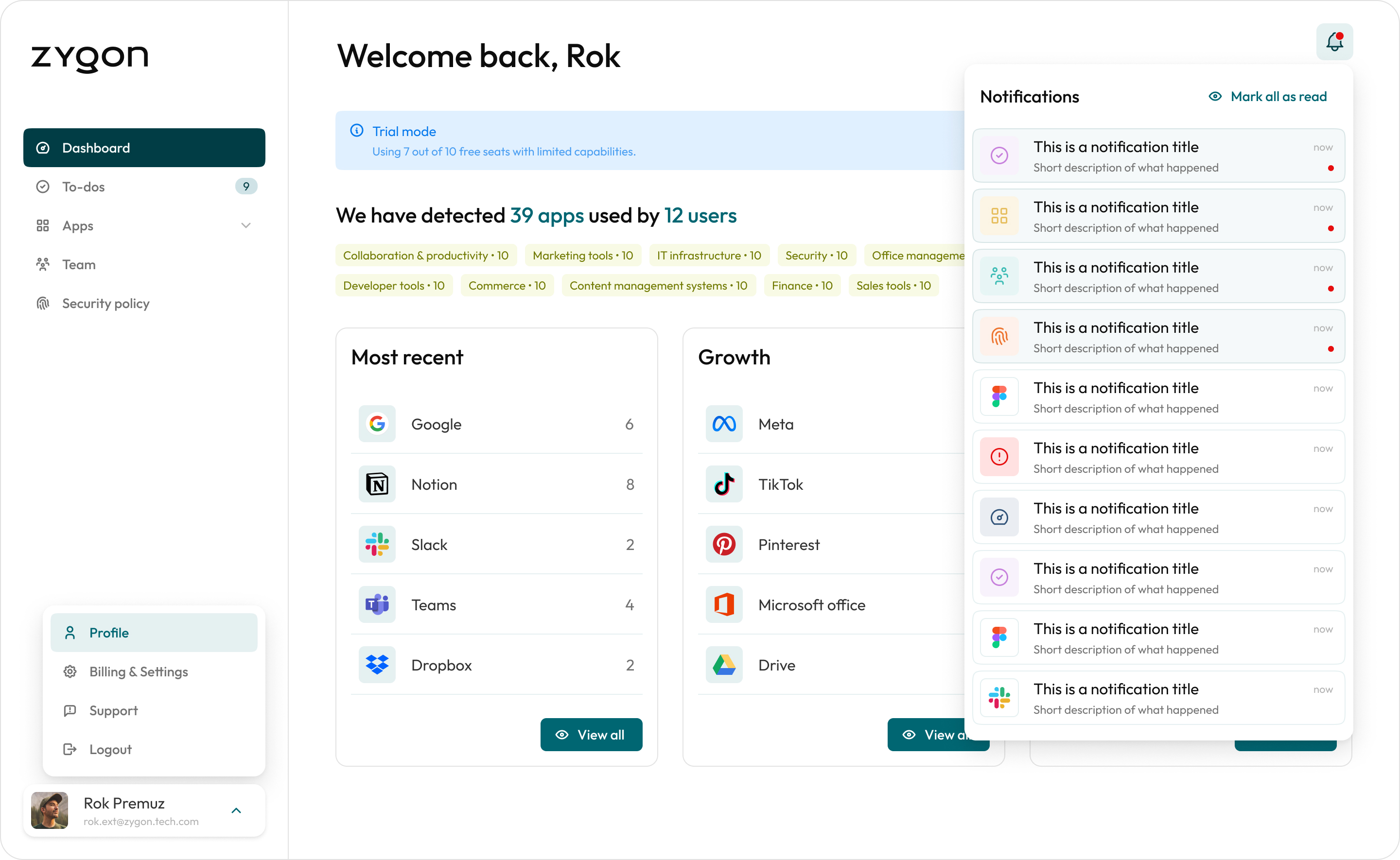
Intro to completed work
Starting off with foundational elements, a pivotal achievement lies in establishing the design system. This framework stands as the cornerstone for all subsequent design endeavors, serving as a definitive reference point against which the coded platform is evaluated.
Subsequently, efforts were directed towards integrating additional features identified through client research sessions and presentations to prospective new users.
List of completed tasks:
- Completely new (first) design system
- Figma designs for the complete app and ux optimisations
Added new features:
- To-do’s
- App & user management
- Notifications
- Security policy
- Organisation settings
- App triage
Process overview

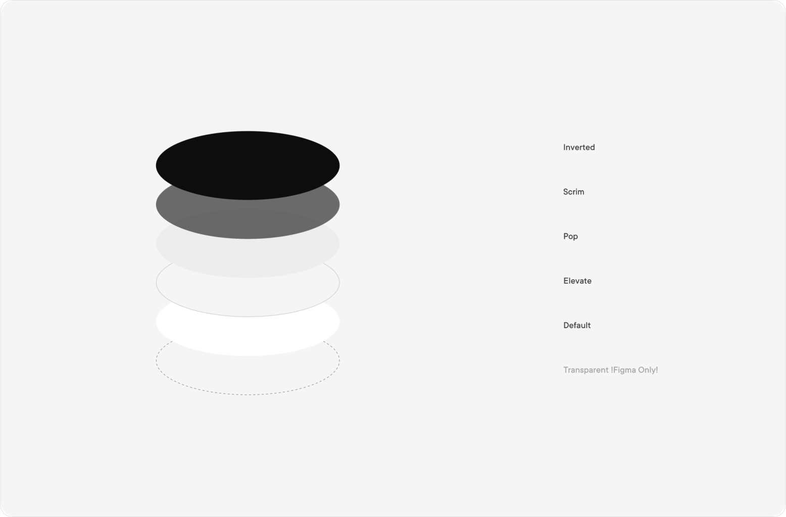
Strating point
Commencing with a comprehensive audit of existing components, I had the opportunity to assess the app's current state and functionality. This process also provided insights into the level of consistency in the current design. This initial assessment serves as a foundation for streamlining and unifying different styles, ultimately evolving into the development of a cohesive design system.
New file structure

Component audit
During the initial stage, I had to take app screenshots and audit the existing elements to determine which components are needed. Shown here is just one of the examples.

Example component - Toast
This excerpt showcases a page from the Zygon design system, demonstrating the breakdown and instructions for the toast component, as well as the change log, which makes it easier for the development team to quickly identify updates and apply them. Present is also a link to the component in the code library, meaning there’s always a connection between the designs and code.
It shows the basic component and variants / different types that can be derived from the base component. The first card also demonstrates the positioning of the element in the UI and the rules it follows, as well as the anatomy with all the spacings, margins and sizes.
The usage card demonstrates how the component is to be used in the UI, but more importantly, how not to use it.
Change log tracks all the changes and below it a screenshot of how the component can be manipulated in the designs.

Results of my work
The outcomes of our efforts can be segmented into two key stages. Firstly, the completion of the design system facilitated the quick recreation of all existing app screens in Figma. This allowed for the seamless application of UI/UX enhancements, elevating the app to a level where it felt more professional to the users. However, the true significance of the design system extends beyond this initial achievement.
The implemented system has successfully established uniformity across the entire app, eliminating the disjointed feel previously present in different sections. Furthermore, developers now benefit from a streamlined process of locating and integrating components into new designs, thereby reducing both code maintenance time and costs. The adoption of a single version for each component has replaced the need for managing multiple instances.
The second stage encompasses the post-redesign developments. Following the app's revamp, the team updated their presentation slides and initiated meetings with potential investors. The redesigned interface, presenting potential value more clearly, coupled with the enhanced confidence derived from a professionally polished appearance, secured Zygon a substantial investment of 3 million dollars. This infusion of capital ensures the sustained operations of the company well into the future. Notably, Zygon's accomplishments have been recognized, earning the prestigious nomination as Europe's startup of the year.
Conclusion & key learnings
The outcomes achieved over a four-month period have proven favorable. During this time, my contribution involved aiding the team in implementing various features and leaving them equipped with a framework designed for seamless expansion of existing features and prototypes. By adhering to the principles outlined in the design system, the team can effectively manage costs while upholding a high standard of quality.
Recognizing the constant learning curve inherent in any project, especially within the context of Zygon's early-stage development, the emphasis was on creating a foundational structure that is both accessible and robust. This approach ensures ease of adoption, comprehension, and maintenance for the small yet ambitious team. The implemented design system employs straightforward naming conventions for color and font tokens, as well as components. This simplicity is further reinforced by Figma-based designs that utilize components from the design system, providing clear insights into their application within the UI and the corresponding design patterns.
The positive response extended beyond internal satisfaction, as external validation manifested in the form of a $3 million funding injection following the implementation of the designs. Notably, the Figma files, acknowledged for their visual intricacy and ease of implementation, contributed to this success. Furthermore, this achievement was underscored by Zygon's nomination for Europe's startup of the year, affirming the overall success of the undertaken work.
Thank you,
Rok P.
GET IN TOUCH
Do you have a problem, and nobody else can help? Maybe you can hire me. I'm a seasoned product designer with experience in data analitcs, complex dashboards, mobile apps and design systems. While I prefer long-term projects, I can also help you evolve your idea to a product and secure you some funding with a polished MVP. Reach out to me and let's talk!
All rights reserved, Rok Premuz & Dezeenika d.o.o. 2024