HES Enerdat
Project showcase by Rok Premuž • November 2023
HES provides software to monitor and take actions upon smart grid metering systems. Present across the globe, their software is used to manage millions of meters.
My role was Product/Systems Designer, creating new components and maintaining the design system I created, designing new features and updating the UI
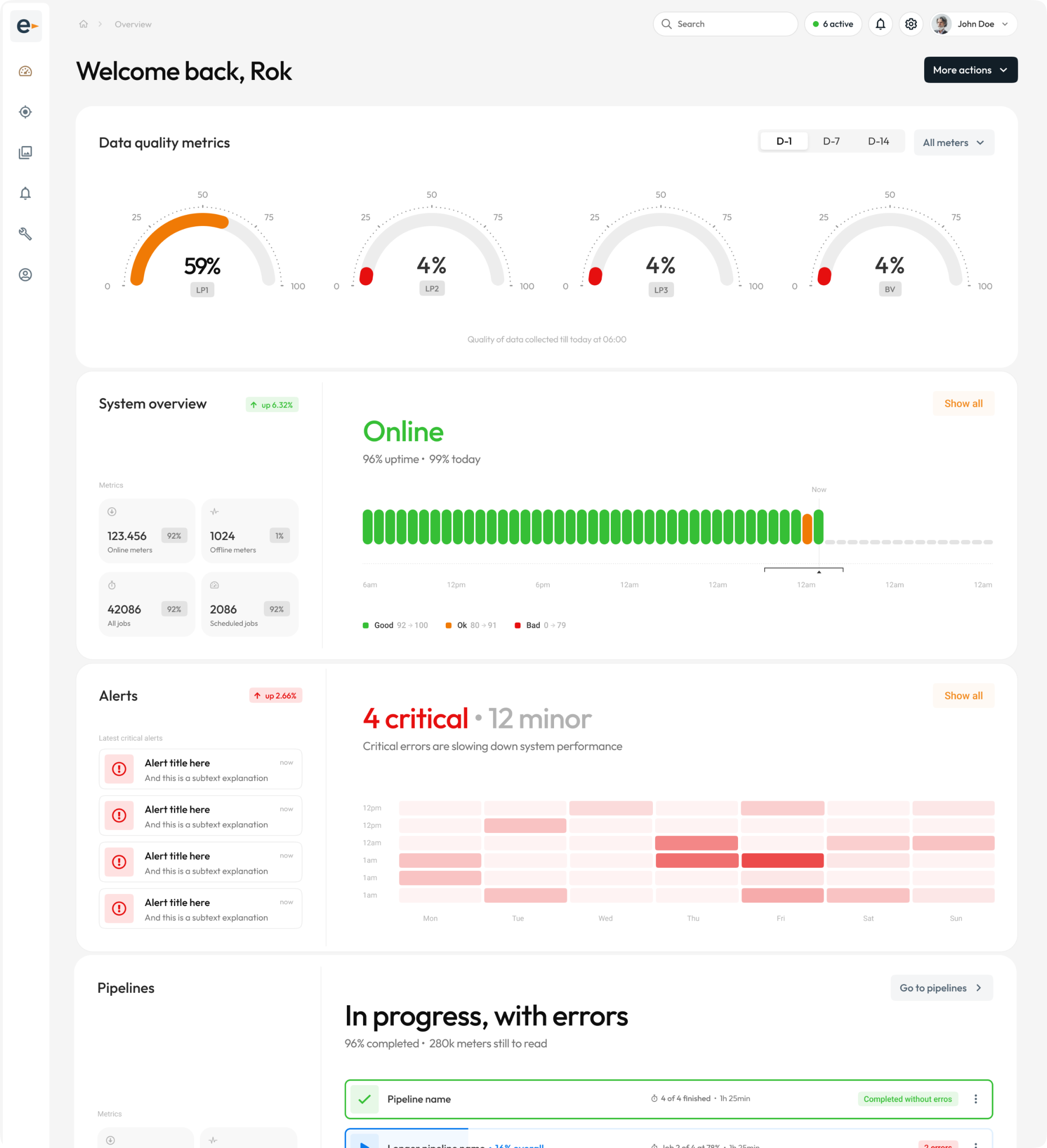
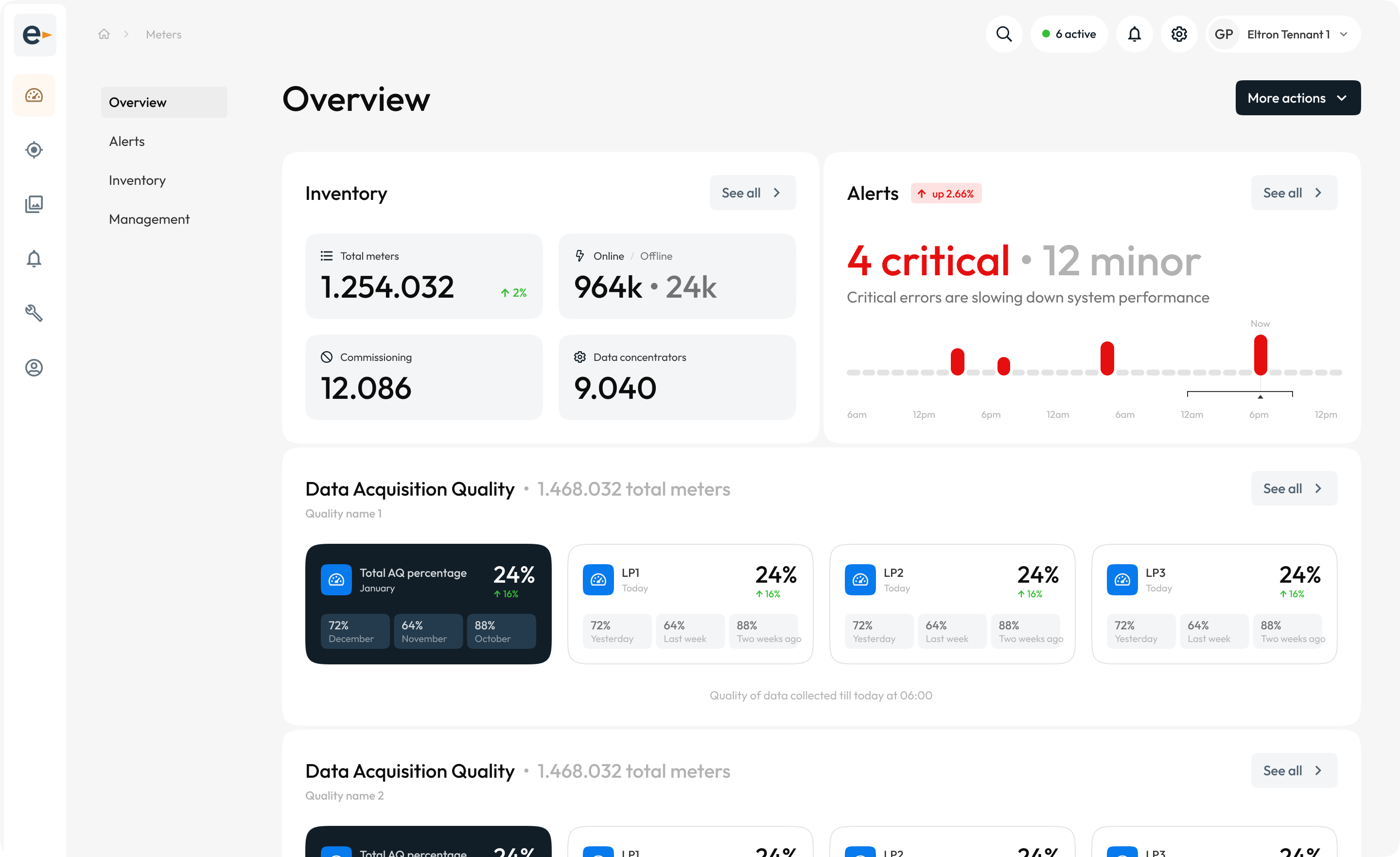
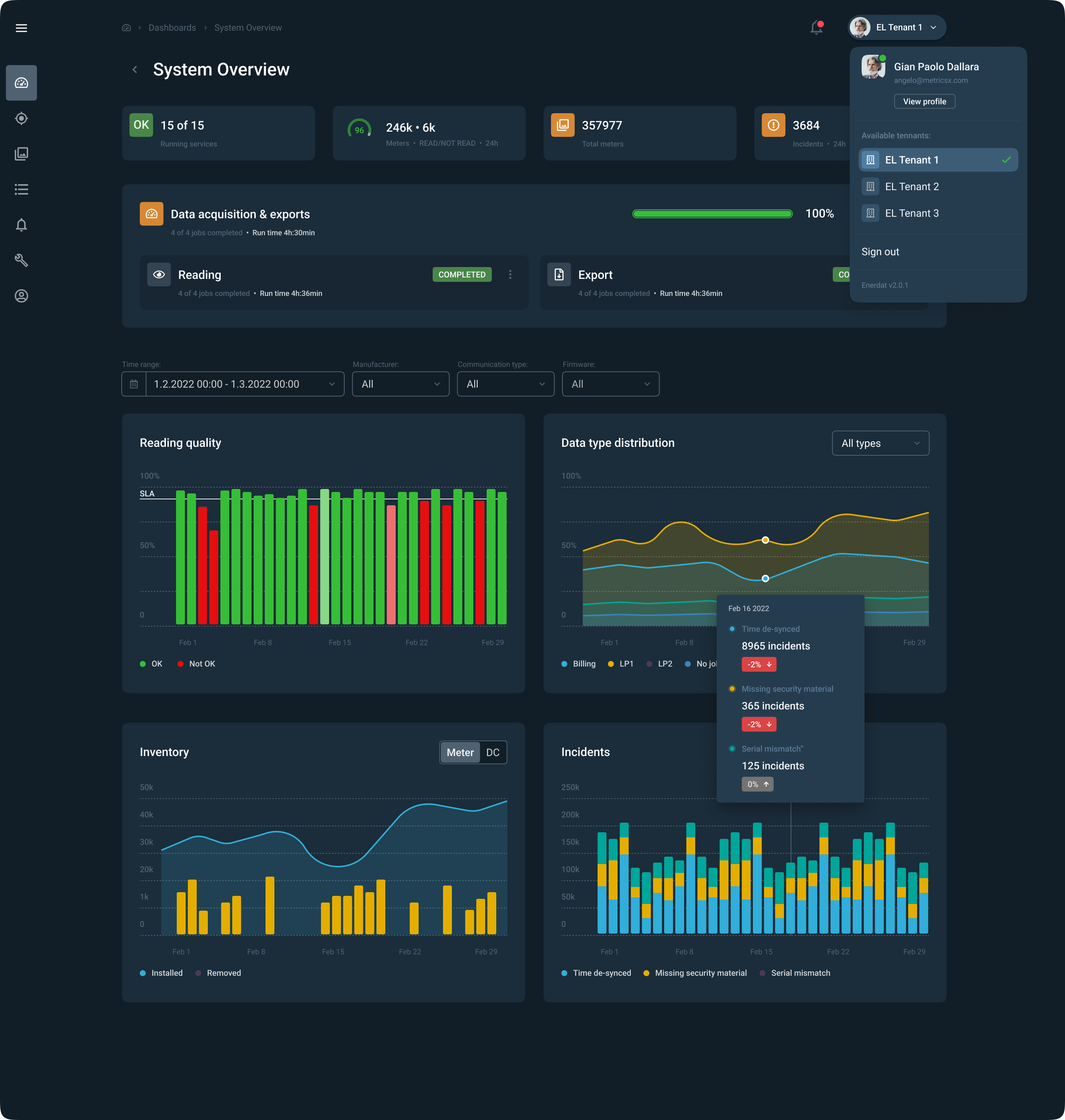
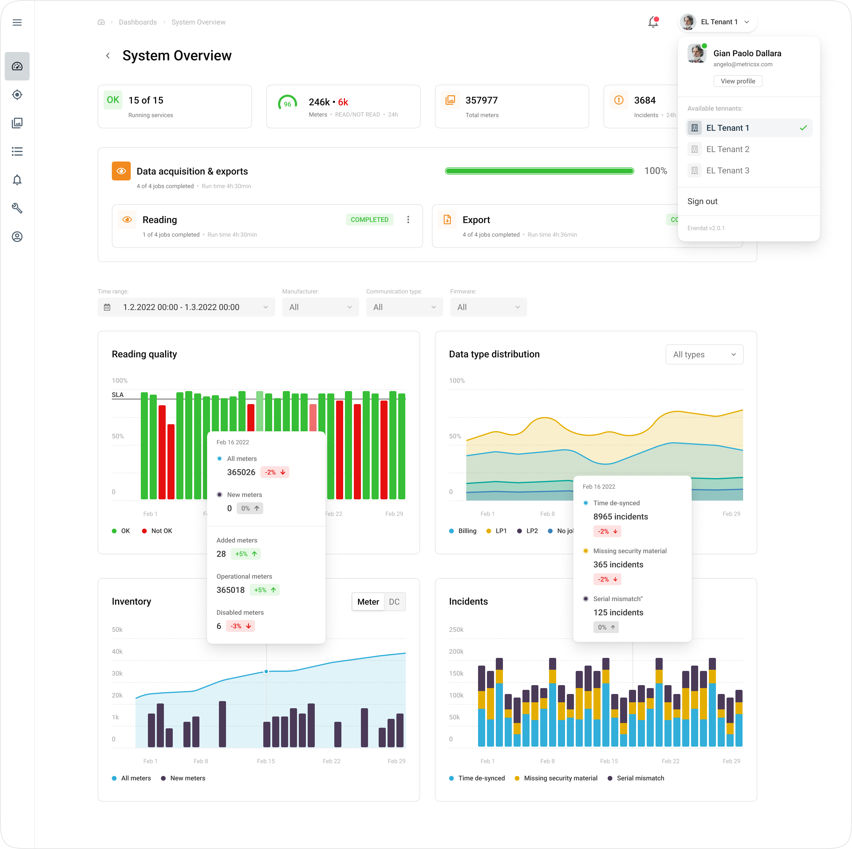
Updated Dashboard (wip)
The newly redesigned framwork offers modular navigation and extended metrics display options.
New dashboard concept thats in the works soon to be released.
Additional layouts offer more modular and extended navigation options.
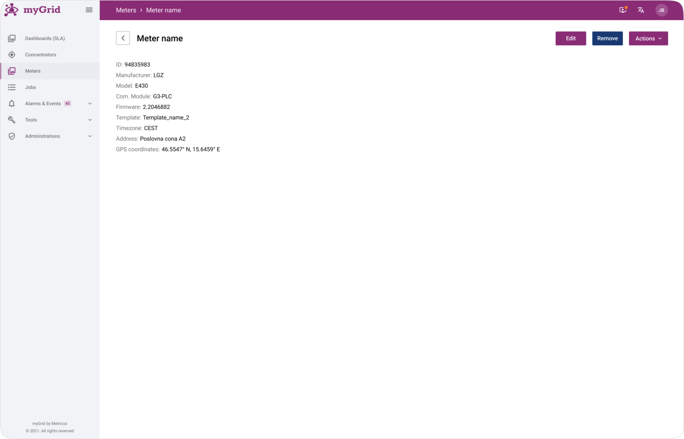
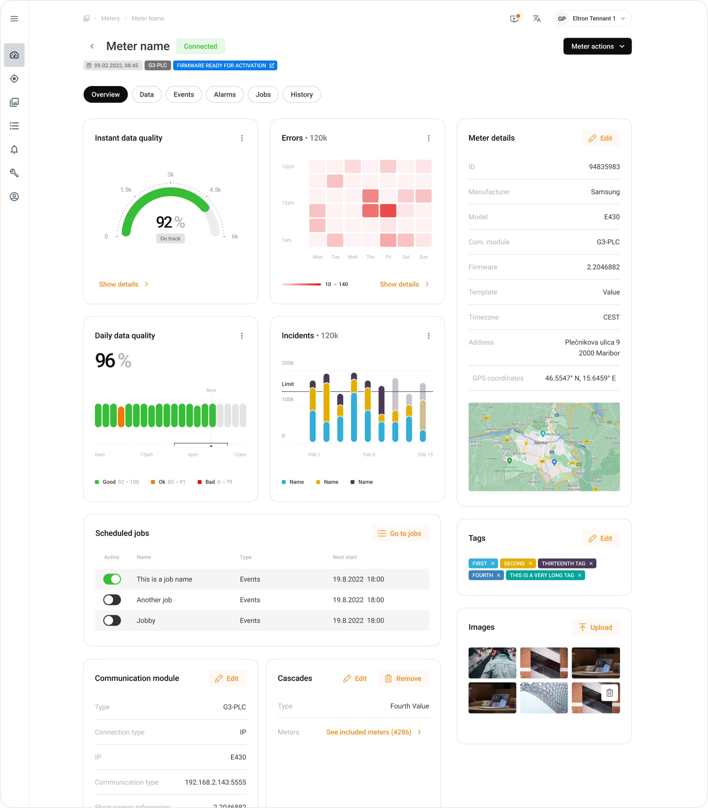
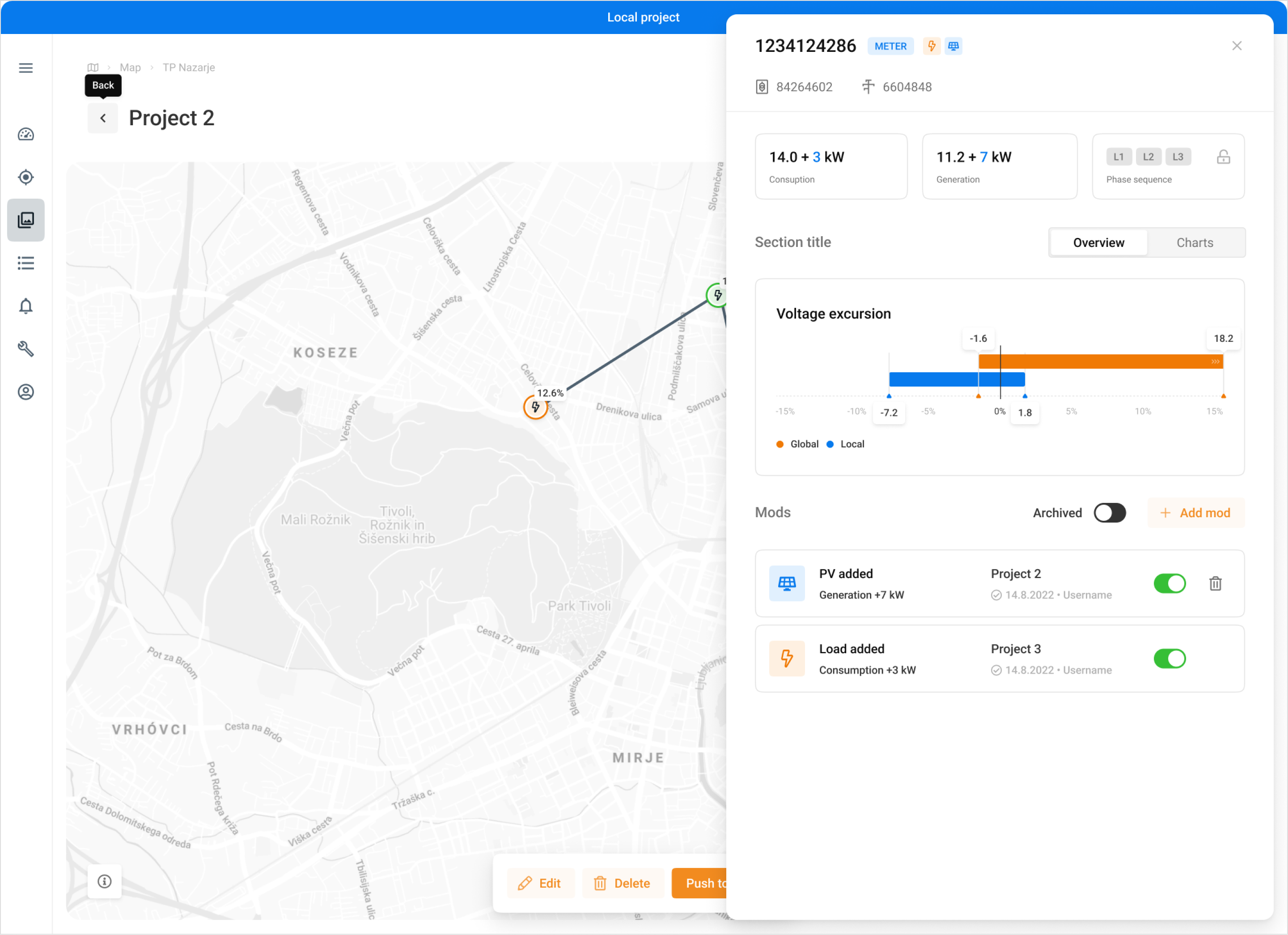
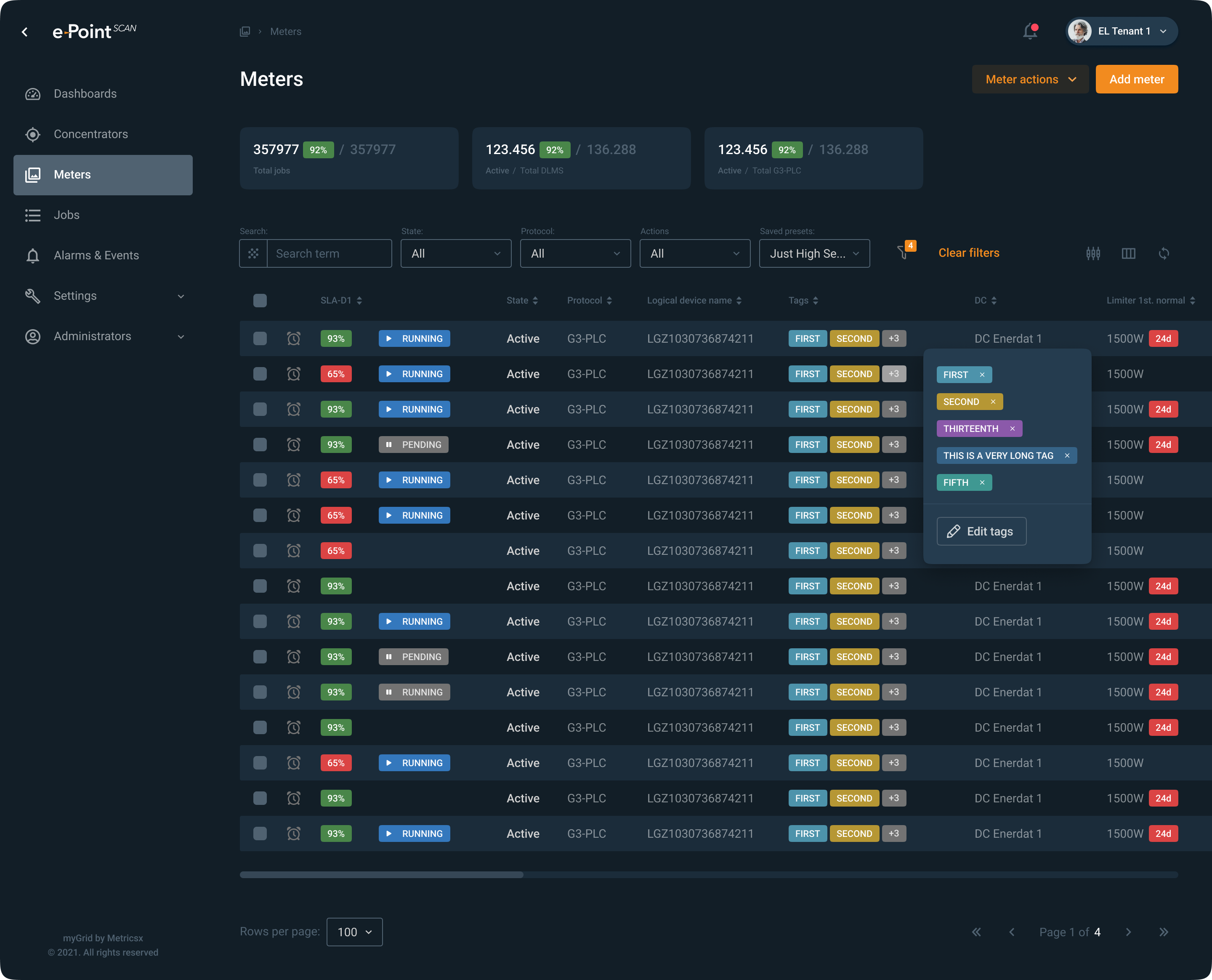
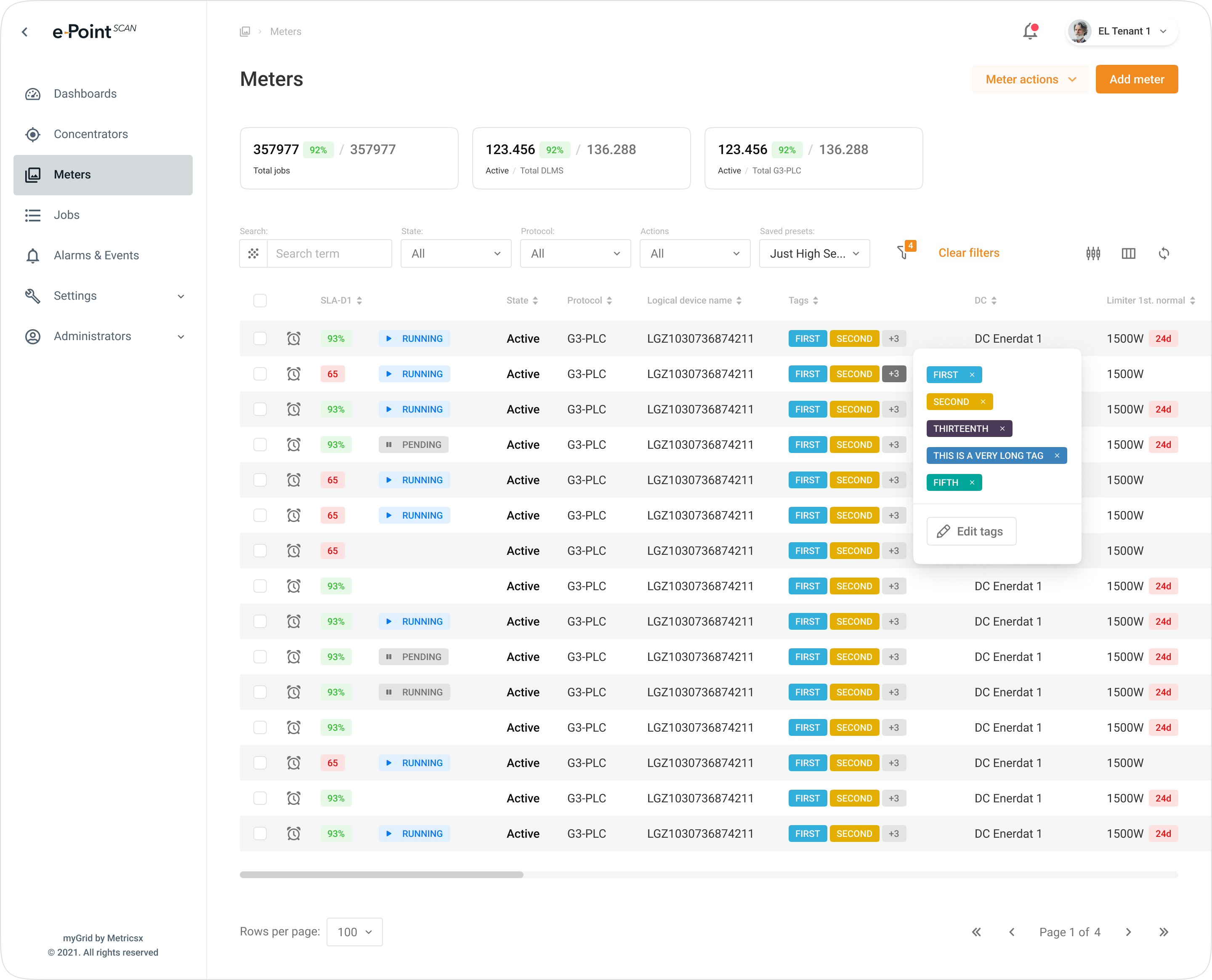
Smart Meter Page Redesign
Original smart meter page with an adjusted layout based on simple margin and other spacing rules.
Smart meter page after the redesign and an extended functionality overhaul.
Meter information is also available in a sidepanel with a slightly contextualized array of information.
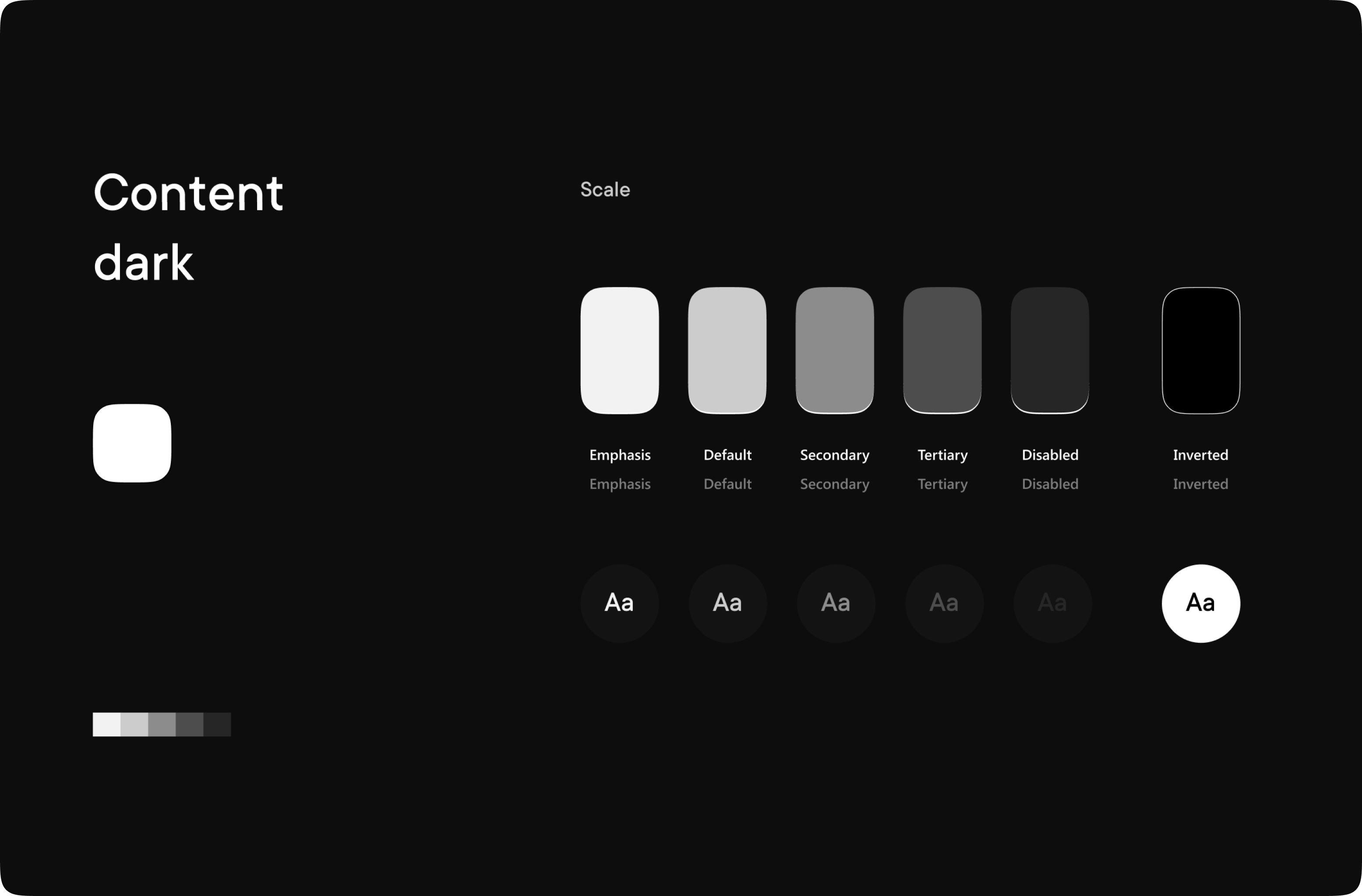
Dark Mode
Dark mode developed for the current dashboard. Colours are slightly adjusted to make sure the contrasts and other accessibility aspects aren't impacted.
Light version of the dashboard.
Smart meter tables with the dark mode turned on.
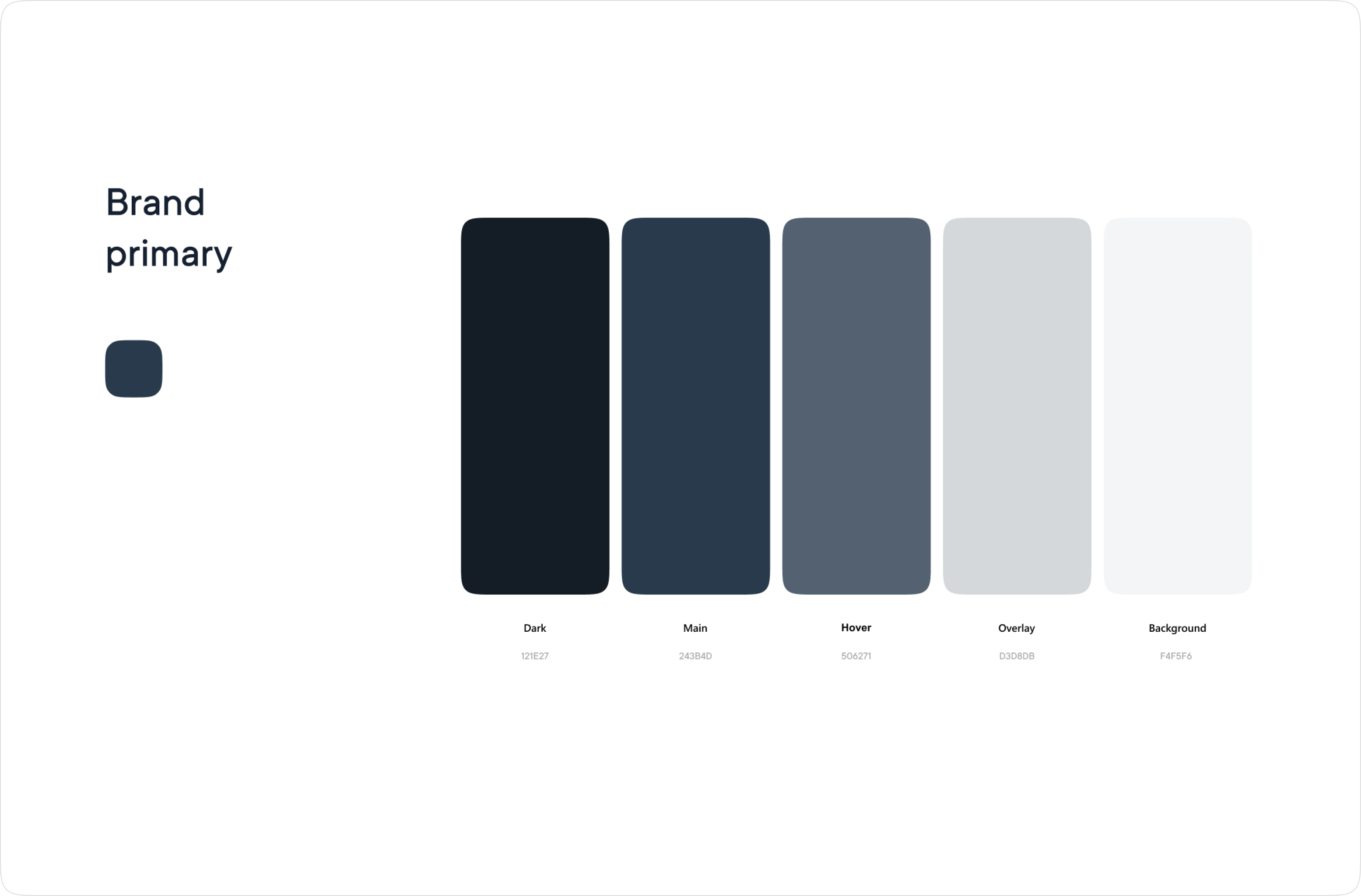
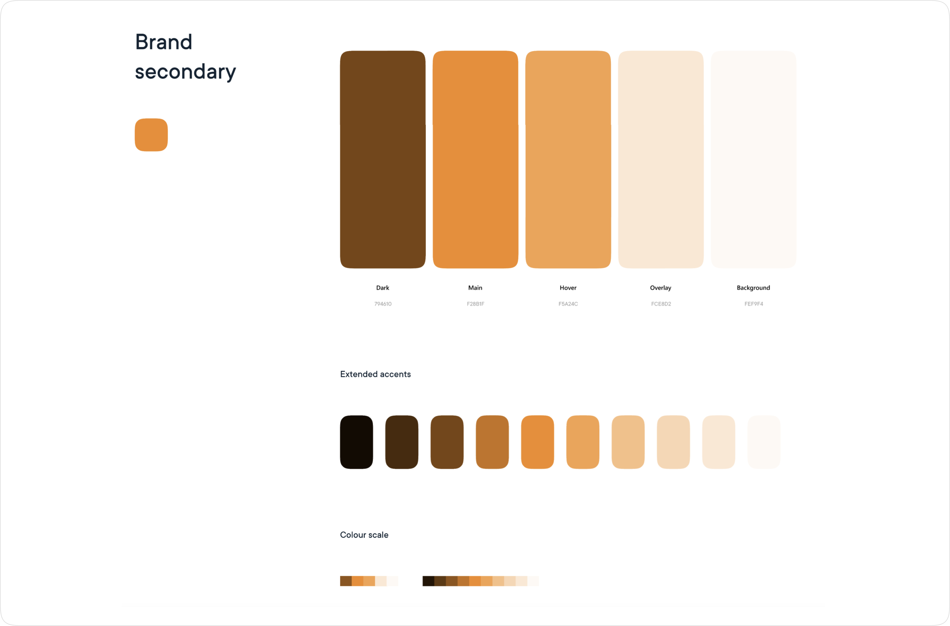
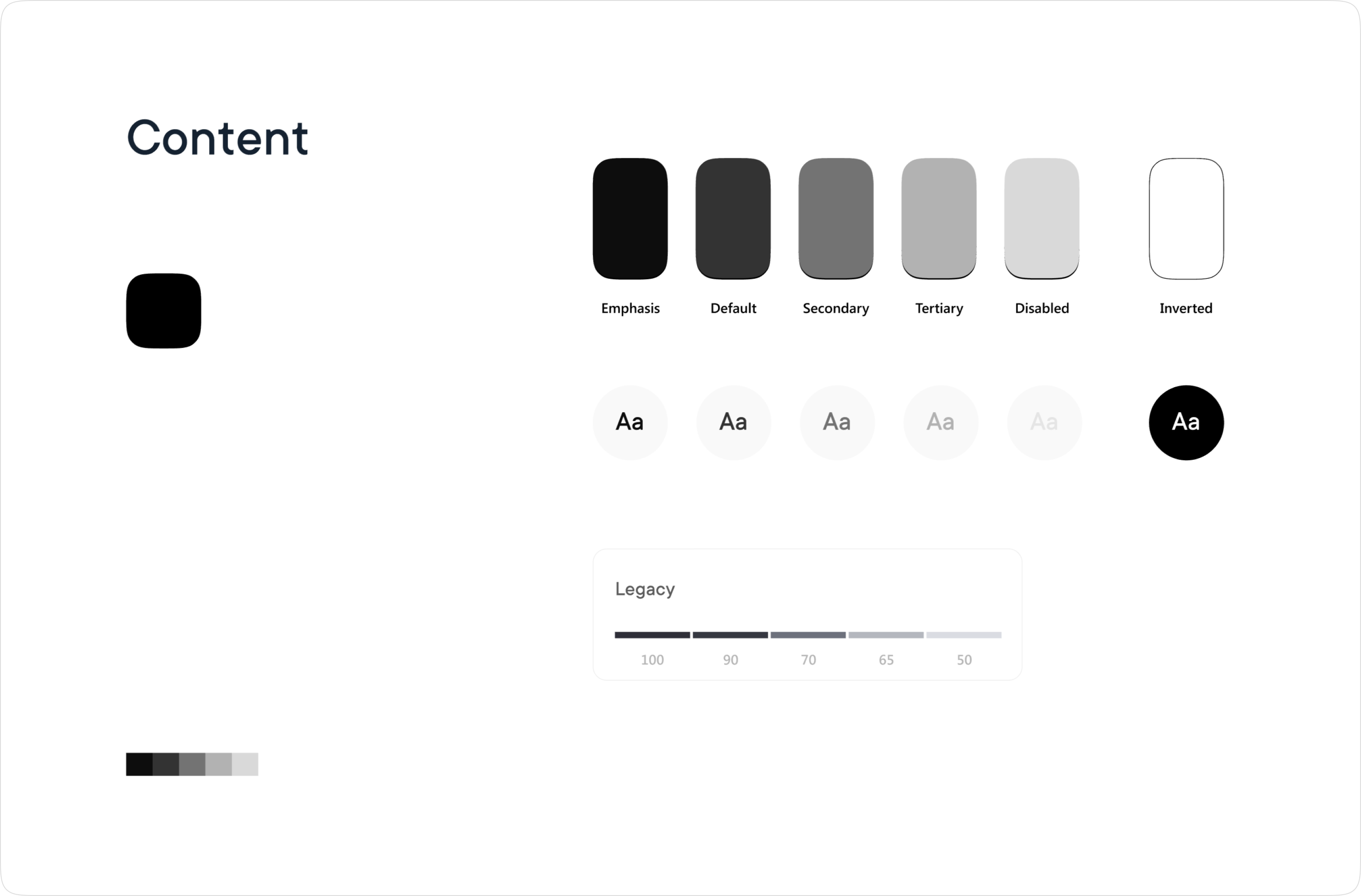
Design System
Primary brand colours are used in the presentation materials and some other interactive component.
Secondary brand colours are used for CTA's and clickable elements.
Content colours are used for texts and some interactive elements.
Inverted content colours to be used in the dark mode.
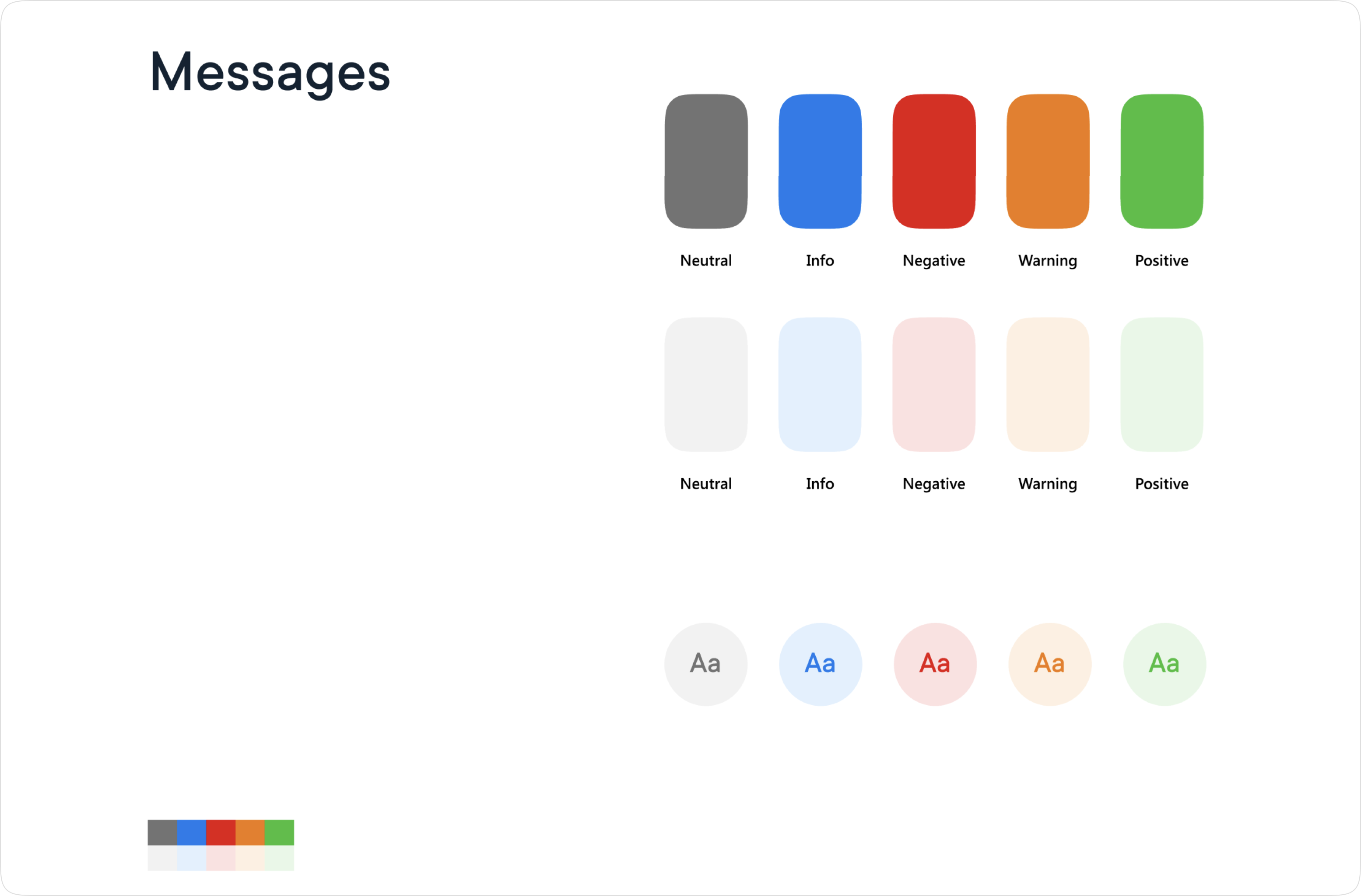
Message colour are used for any communiction from the system to the user. This includes alerts, notices, etc.
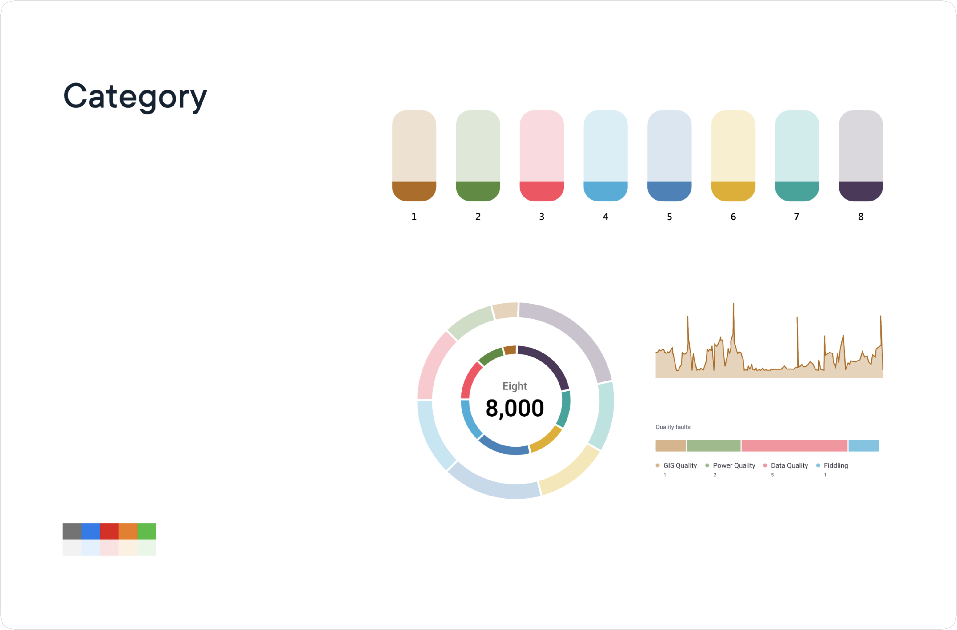
Category colours have been selected to be easily distingushable in charts, even when multiple are overlayed.
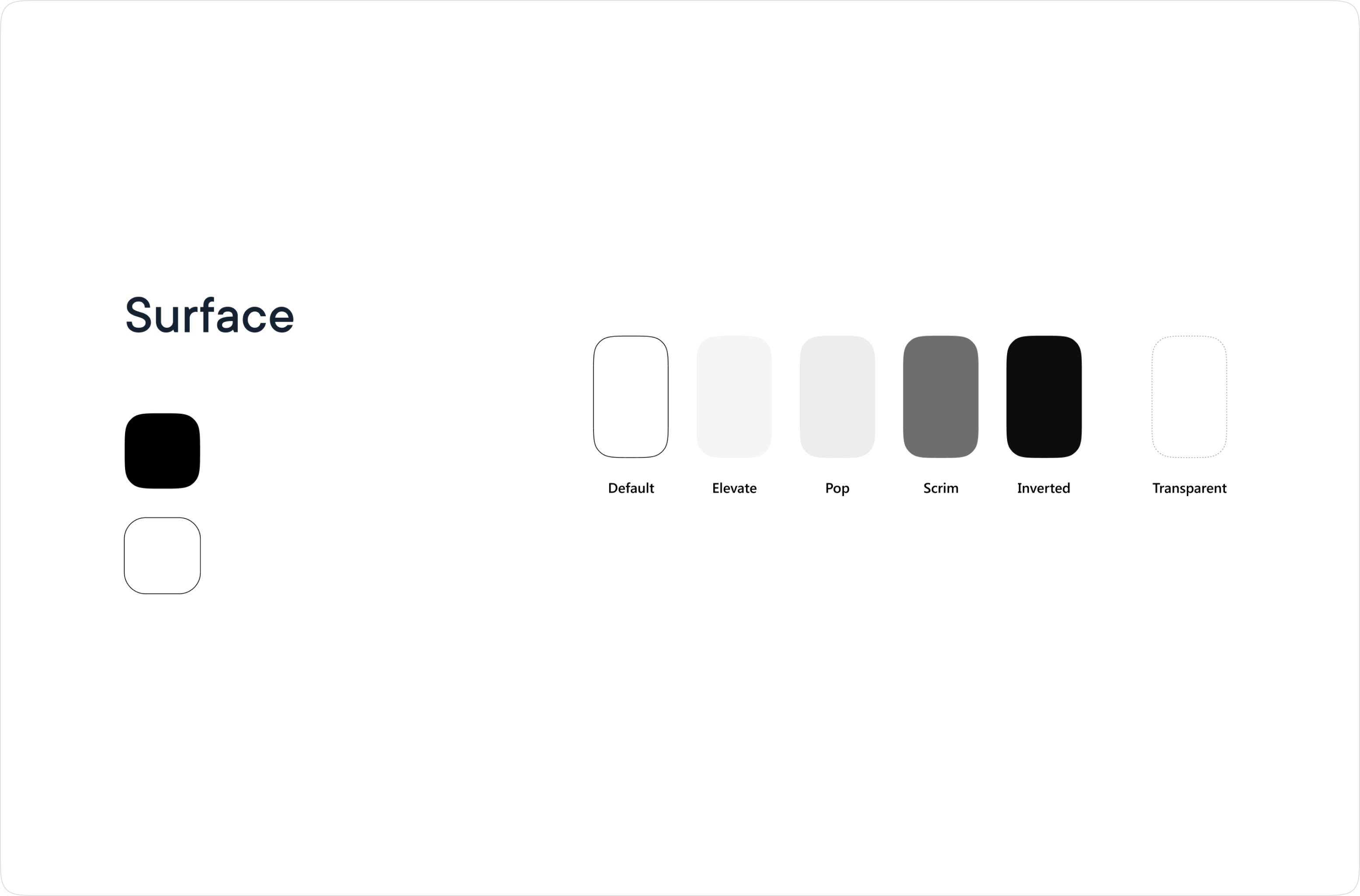
Surface colours define the backgrounds of the system components such as the main views, modals and larger container components.
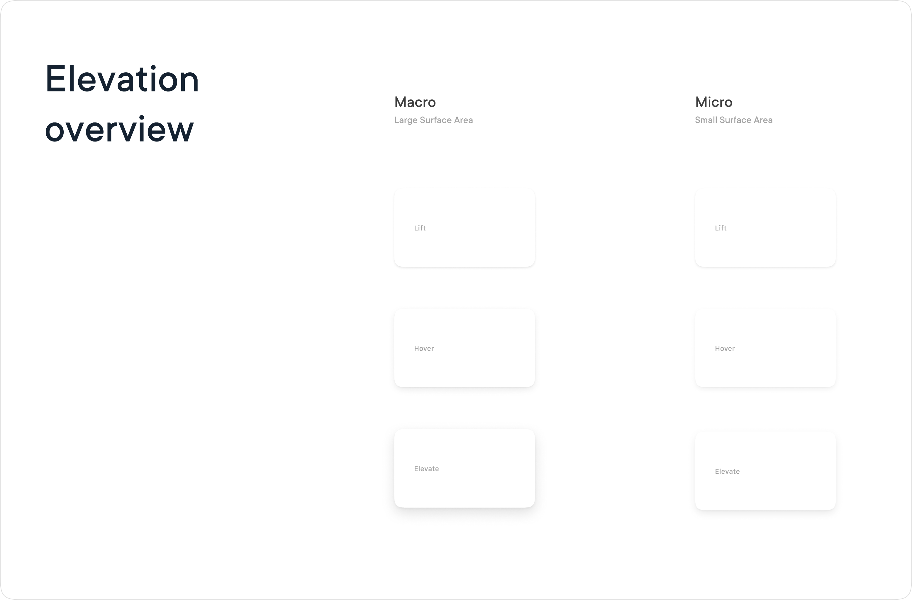
Elevation is separated in two categories - micro for really small elements such as tooltips, and macro for larger elements like modal windows.
Comparison between macro and micro elevation shadows.
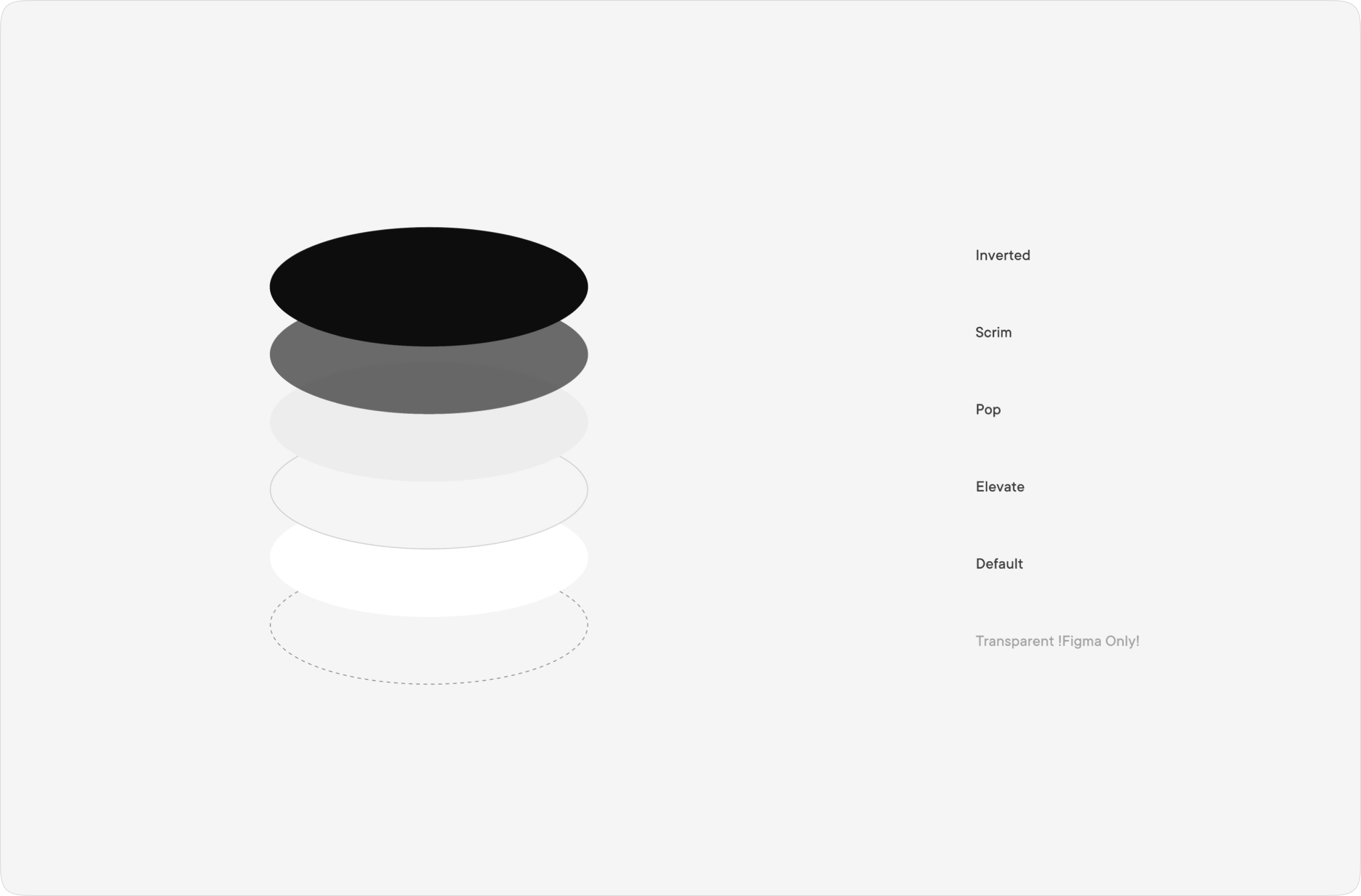
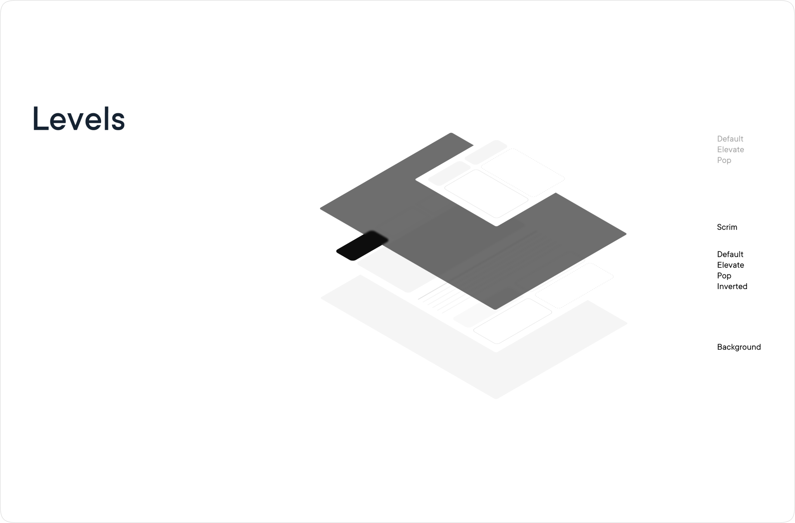
Levels structure allows any new person on the project to quickly understand the colour structure.
Detailed representation of levels.
Stroke styles which are used for the elements with borders and dividers.
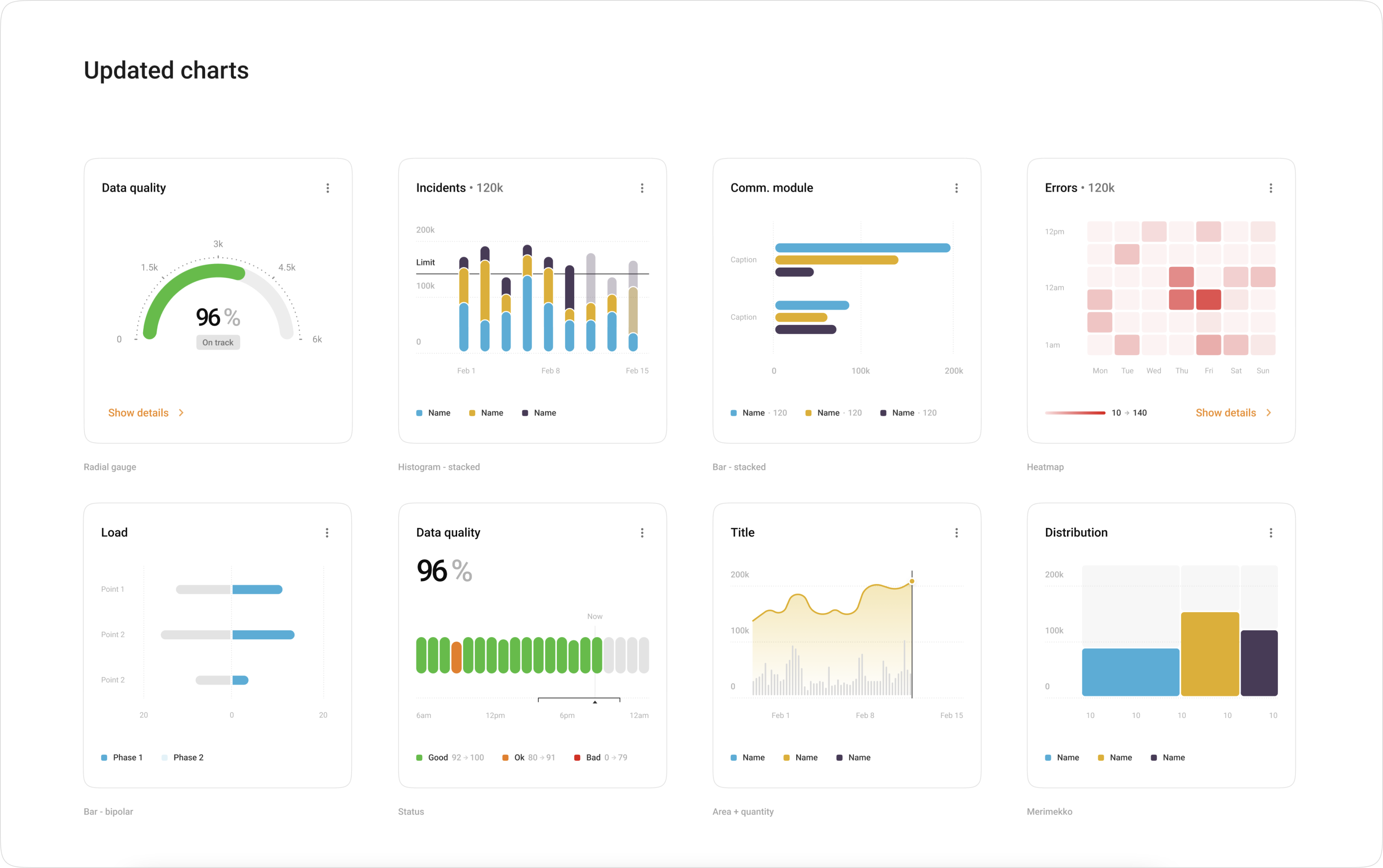
Part of the latest update is also a powerful advanced chart library designed from the ground up, to make sure data is represented in the best possible way.
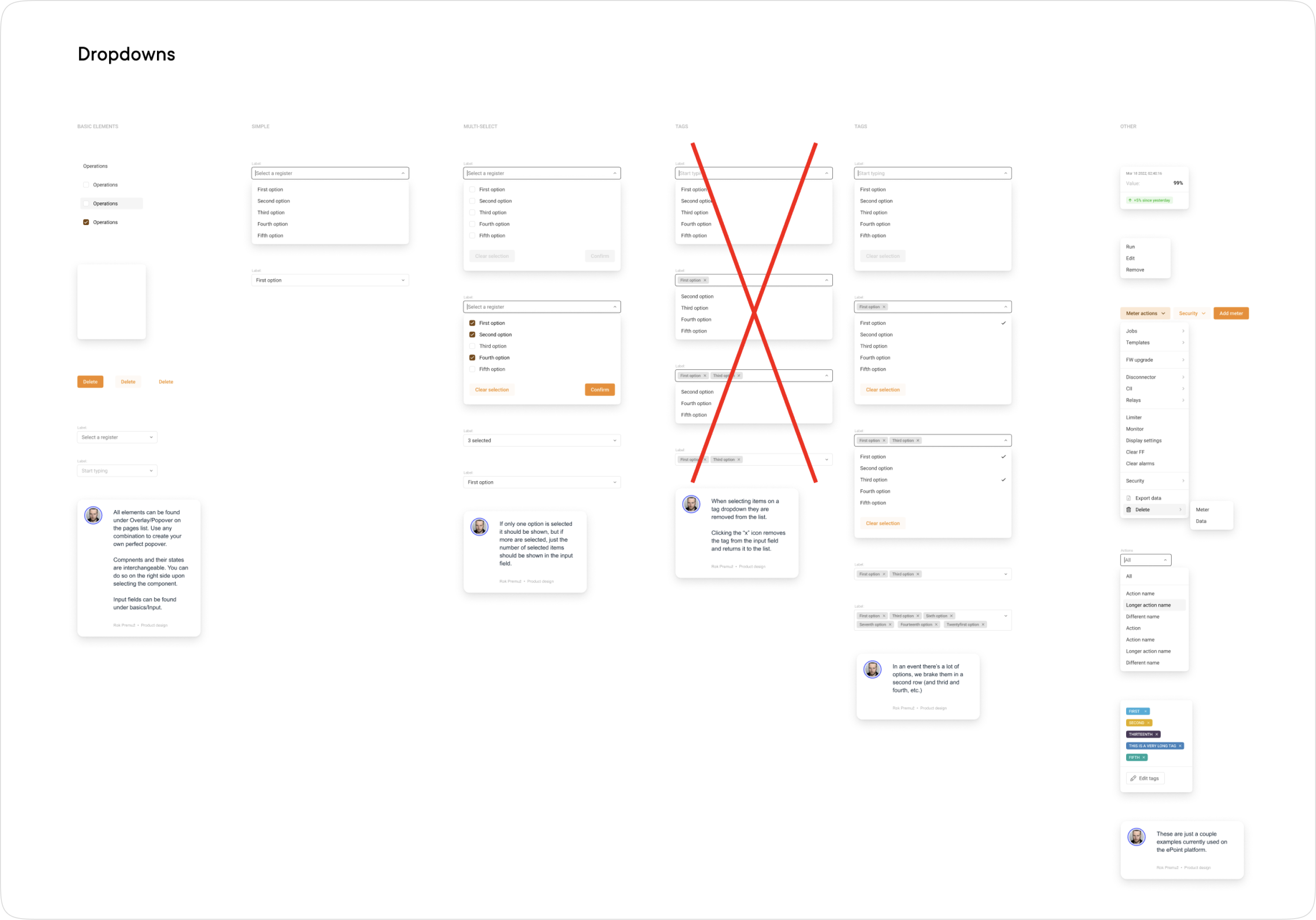
Design system is filled with guiding documents on how to use different components, and how to propperly setup patterns.
I have grown the current design system to 276 components.
GET IN TOUCH
Do you have a problem, and nobody else can help? Maybe you can hire me. I'm a seasoned product designer with experience in data analitcs, complex dashboards, mobile apps and design systems. While I prefer long-term projects, I can also help you evolve your idea to a product and secure you some funding with a polished MVP. Reach out to me and let's talk!
All rights reserved, Rok Premuz & Dezeenika d.o.o. 2024